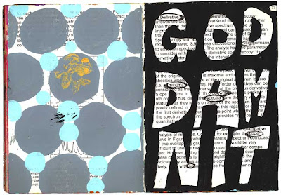
Here are the pages for friday. Regular follows along the lines of average from yesterday. Let's have a cocktail. Perfect artwork for friday.
Last but not least, is good girls don't fight. This came about after Christian Clayton lent me a book called "She Fights," a book full of pictures of haggard looking women fighting each other in their lingerie on dirty shag rugs. The back cover says "Catfighting & wrestling women. Females who love to fight." The book is all wrong, but for some reason fascinated me. It probably was very racy back in the day, but seems pretty tame by today's standards.
Anyway it inspired me. I have done several versions of this. I guess I am exploring the fact that most women are brought up to be "good." There are times when I'd like to punch someone or kick some ass, but I would never in a million years actually do it. I wonder what it would be like.
Friday, March 30, 2007
Thursday, March 29, 2007
sketchbook o' love
More pages from my sketchbook o' love. The great thing about sketchbooks is you can do artwork that sucks and it doesn't matter.
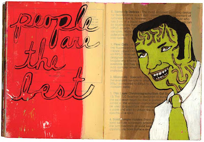
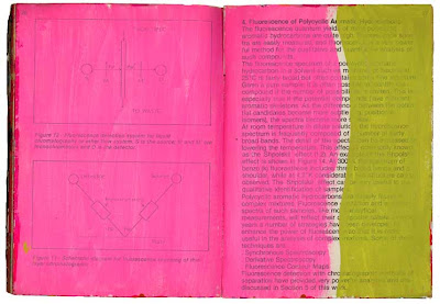
The top two pages suck. I tried to make them better, but I failed. It is important to mess up. We all try to create the perfect masterpiece, but it is the mistakes that make you a better artist. If you give yourself permission to mess up, it frees you up to relax and have fun. Trying to be perfect just screws you up. Yuck that sounds so motivational-speaker-self-helpy. Maybe I should write a book called Permission to Suck! What's so great about perfection anyway?
The bottom page makes me happy though. It has gotten a lot of good response and even some jobs came out of it. Sometimes simple is better. The day I did it I was feeling like an average shmo. Wah wah wah.
Wednesday, March 28, 2007
Sketchburgh
Hello again. I like these pages. Haven't looked at them in a while. It is fun to revisit. Let's see. The bottom pages are about shaving your legs. Luckily I am not a very hairy person except on my head. I wonder who the first person was to shave their legs?
The middle pages were painted over a "Lobster Balls" recipe. Anything with "balls" in it makes me laugh. I have a very juvenile sense of humor. This one says "grateful for the company." So it is a little about loneliness too. Maybe this lady baked a ham so people would come over for a visit and maybe she served lobster balls for an appetizer.
The top pages are more about playing with color. I am not a fan of matchy matchy colors (even though the middle pages are all about pink) and like to try unusual combos.
Thanks for looking!
Tuesday, March 27, 2007
sketchbook burrough
Some of these pages are on my website so if you have looked there you might have seen them before.
The top pages have been revised a couple times. You can kind of make out the drawing underneath. I used a ball point pen and it leaks thru if you paint over it (we call it fugitive ink at art center). I like how it turned out. Lunch at the Olive Garden makes me sad. I am kind of a restaurant snob and chains make me crazy.
There is a Cheesecake Factory in Pasadena and there are always a million people waiting to eat there. This makes me INSANE! Why would you go to the Cheesecake factory when there are all these small cool restaurants to choose from? Why eat in a restaurant that has "factory" in the name and has advertisements in the menu? The food is salty and gross and the portions are obscenely large. It is just disgusting.
OK finished with my Cheesecake factory rant. All my friends have heard it before. I hate that place!
The bottom two pages are just random patterns. I did them a while ago and am bored with them.
P.S. From now on I am only going to post 5 days a week. I need a little break on the weekends even though I will continue you to post on my one-a-day art website.
Monday, March 26, 2007
rainy sketchbook day
Howdy. Let's see these pages were done a while ago. The top is about the all the bad things you tell yourself in your head. So stupid. Why do we do it?
I don't like the middle page all that much. It is cheesy. I can't remember why I did it. Must have been something on the TV. Talk to the hand. Old.
The bottom pages are more of the old maid thing. I must have been feeling insecure when these were done. I was married once but am not anymore. Being married can be good or bad or both. Dig it? Nobody really calls anyone an old maid anymore so this was just random. There are too many colored dots on these pages. I think I have gotten that out of system. I hope.
Sunday, March 25, 2007
sketchbook galore!
Heck yeah here are some more dang pages. The top page is self explanatory. I do have big boobs. The woman is from a Mark Eden advertisement. Mark Eden Miracle Cream. Makes your jugs big! I am obsessed with products to make your boobs bigger.
The middle page is self explanatory too. People do suck on occasion. I threw in a little "fight stains" for good measure. Advertising copy separated from it's advertisement makes me happy.
The bottom page is a collage using an old ditto master, a stamp and some star stickers. Younger people probably have no idea what a ditto is, but the old farts will know. I'd love to find an old ditto machine and make art with it. That would be very cool. Random thought, do they still show filmstrips in schools? I doubt it.
Saturday, March 24, 2007
Up with sketchbooks! YAY
This sketchbook is wrecked. The pages are falling out because of so much handling. The top pages include a napkin from Chipotle showing how to fold a burrito. Random. This is done with acrylic and ball point pen.
The middle pages are about dating. I got a mini Old Maid deck of cards and glued them on the page. I say if you end up with the Old Maid card you win. They should make the Old Maid hot. I actually painted a deck of Old Maid cards. You can see it on my other website. Just arrow down to my January 11 entry. So anyway dating sucks and tends to end up in my sketchbooks a lot. I am not very good at it. I do have a crush on Mike Rowe, the Dirty Jobs guy. I need a guy like that for sure. Oh well what can ya do?
Last but not least is my bored page. I think I ruined it by adding color to the bored part. It was simpler before. But you have to take risks and try stuff even if it ruins something. Thats what sketchbooks are for.
Friday, March 23, 2007
New sketchbook to peruse
Here is a new sketchbook. When I started it it was a strange picture-free cookbook with lots of recipes for liver and 1950s type ingredients. Who makes welsh rarebit these days? I picked it up at an estate sale. I like painting on cookbooks the best.
The middle picture is based on a bumper sticker I saw. "Love Me Love My Mule." Huh? The car was covered with stickers about mules. Sweet.
The bottom image is collage, paint and ball point pen. So is the mule page. I don't like the drips coming down from the Love part. I think I'll paint over that. Too cheesy.
Thursday, March 22, 2007
Sketchbook End of the Road
OK this is the last of this sketchbook. As you can see there isn't much to look at. Once I do something on these pages I will upload them. I will show more of my other sketchbooks in the meantime.
Last night I went to see Leslie Hall at the Armand Hammer. It was a most enjoyable experience and I am still smiling the next day. She is hilarious and amazing and a great performance artist, refreshing and inspiring in this world of slick, samey, packaged music and videos. Ring a ding ding!
Not everyone will get her, but check her out if she comes to your town.
Wednesday, March 21, 2007
Sketchbook Valley
Getting to the end of this sketchbook. Not much going here but colors and shapes. These pages are mostly in the beginning stages of work. I'll post them again when I add stuff. But I did start painting fruit here and it inspired a couple pages on my painting-a-day wesbite. My sketchbooks definitely influence the rest of my work.
Lately though, I have been neglecting my sketchbooks because I am trying to work on a huge painting and not doing a good job as of yet, just gesso. Freelance jobs take up a lot of my time, so does teaching and my painting-a-day. Having too much to do makes me happy and stressed but I love it. After this sketchbook is done I might post some images from my big painting. Not sure yet... I don't want to give away all my secrets! I also haven't forgotten my portrait project. Too many ideas and not enough time!!
Also thank you for the comments. I love hearing from people. It is nice to know someone is reading this!
Tuesday, March 20, 2007
Sketchbook City
Hopefully you aren't bored yet. Maybe I should do something else. Anyway. Old cookbooks are a source of excellent stuff. I love them!! They need to be from the 50s and 60s, though because the printing quality from that era is the greatest. Check out the pancakes (above the corset in the top image) with letters in them. Very sweet.
So these pages are in various stages of finish. I was trying a little typography and breaking down jello into basic shapes. Jello rules. It is the most amazing thing. I should make sculptures out of jello somehow. Jello fascinates me. I am weird.
Monday, March 19, 2007
sketchbook-a-rama
More pages. This sketchbook is actually painted on a scientific book. When I was starting out I worked part time at Baxter Healthcare. The office I worked in closed down and they had all these old scientific books that were being thrown away. So of course I kept a bunch to paint on. It is better than spending money on new sketchbooks. Plus I hate painting on a pristine white pages so this works much better for me.
Saturday, March 17, 2007
hey more sketchbooks
Sketchbooks are good for putting your mind on paper. They say you shouldn't need words. Your picture should be good enough to get your point across without explaining it. But I love words. I love short declarative statements. So here are some words on paper.
The middle page is an example of the beginnings of a sketchbook page. Just some colors laid down. This page hasn't called out to me yet. I am sure soon there will be something that needs to be painted on pink and green. We will see.
Friday, March 16, 2007
Sketchbook Town
Hello. These super groovy sketchbook pages have a little collage in them, pieces of paper I pick up off the street or find in the messy piles in my studio. I think this is part of a conversation I had about dating. Yuck. Dating is not fun, but it is true the person I would like to date would be different but cute. Simple right?
Anyway I digress, on these pages I was experimenting by being more graphic. Playing with shapes and colors. Breaking stuff down to the basics and adding collage. I like it.
Thursday, March 15, 2007
Sketchbook Village
More sketchbook pages for ya. I hope this is interesting. I get my ideas for the sketchbook from TV, magazines, looking thru all my weird stuff I collect, driving thru L.A., overhearing conversations...randomness.
Some pages turn out better than others. The middle one is a portrait of Brigid Berlin's mother. Uppercrust rich lady with helmet hair and lots of make-up. I am much looser in the sketchbooks. I actually wish I could just do these all the time.
Wednesday, March 14, 2007
More sketchbook pages
Here are some more pages. These were done after watching a documentary about Brigid Berlin called Pie in the Sky. You should rent it if you can. I love documentaries about unusual people and Brigid Berlin is an unusal person. My friend Frieda introduced me to this one.
The color on the pages in my sketchbook usually comes from the excess paint I mix when I am doing a job or a painting. I HATE wasting paint so I cover pages in the book and then go back later and paint over it. I also can't throw away paint brushes even if they are mangled beyond recognition.
Subscribe to:
Posts (Atom)